In a world overflowing with dashboards, spreadsheets, reports, and research findings, the ability to turn complex information into something people can understand quickly is more valuable than ever. AI infographic makers are changing how teams, educators, marketers, analysts, and creators present data by transforming raw ideas and statistics into polished visual stories with far less effort than traditional design tools require.
TLDR: AI infographic makers simplify data presentation by helping users turn numbers, concepts, and reports into clear visual layouts. They can suggest designs, organize information, generate icons, create charts, and adapt content for different audiences. These tools are especially useful for people who need professional-looking visuals but do not have advanced design skills. The best results still come from combining AI speed with human judgment, editing, and accuracy checks.
- Why Data Presentation Needs a Simpler Approach
- What Are AI Infographic Makers?
- How AI Makes Infographic Creation Easier
- The Role of AI in Turning Raw Data Into Visual Stories
- Key Features to Look For in an AI Infographic Maker
- Who Benefits Most From AI Infographic Makers?
- AI Does Not Replace Good Judgment
- Best Practices for Creating Better AI-Generated Infographics
- Common Types of Infographics AI Can Help Create
- The Future of AI Infographic Tools
- Final Thoughts
Why Data Presentation Needs a Simpler Approach
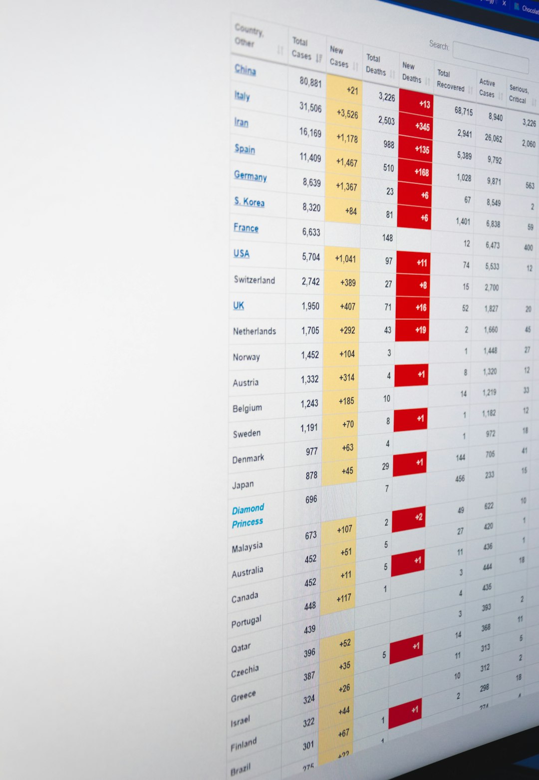
Data is powerful, but only when people can understand it. A spreadsheet with thousands of rows may contain important insights, yet most audiences will not have the patience or time to interpret it. Even a well-written report can lose impact if the key findings are buried in dense paragraphs. This is where infographics shine: they combine visual hierarchy, concise text, charts, icons, and storytelling to make information easier to absorb.
However, creating a good infographic has traditionally required a mix of design knowledge, layout skills, chart-making experience, and editorial judgment. For many small businesses, teachers, researchers, nonprofit teams, and content creators, that can be a barrier. AI infographic makers reduce that barrier by doing much of the initial structuring and design work automatically.

What Are AI Infographic Makers?
AI infographic makers are digital tools that use artificial intelligence to help create visual data presentations. Instead of starting with a blank canvas, users can often begin with a prompt, a document, a dataset, or a short description of the message they want to communicate. The AI then suggests layouts, visual themes, chart types, color palettes, headings, and sometimes even summarized copy.
These tools vary in sophistication. Some focus on generating complete infographic drafts from text prompts, while others enhance traditional design platforms with AI-powered features such as automatic resizing, chart recommendations, image generation, and copywriting assistance. The common goal is the same: make visual communication faster, clearer, and more accessible.
How AI Makes Infographic Creation Easier
The biggest advantage of AI is not just speed. It is the ability to guide users through decisions that would otherwise require design or data visualization expertise. A strong infographic must answer several questions: What is the main message? Which data points matter most? What type of chart should be used? How should the reader’s eye move through the page?
AI can help with these choices in several practical ways:
- Content summarization: AI can condense long reports or articles into key points suitable for visual presentation.
- Layout generation: It can arrange sections, headings, icons, and charts into a balanced design.
- Chart suggestions: AI may recommend bar charts, line graphs, pie charts, timelines, or comparison tables based on the data type.
- Writing assistance: It can generate titles, captions, labels, and short explanatory blurbs.
- Style matching: Many tools can adapt colors, typography, and visual tone to suit a brand, classroom, report, or social media post.
For someone who is not a designer, these features can turn a difficult creative task into a guided workflow. For professionals, they can reduce repetitive production time and free up energy for strategy and refinement.
The Role of AI in Turning Raw Data Into Visual Stories
A common misconception is that infographics are simply “pretty charts.” In reality, an effective infographic is closer to a story. It has a beginning, a middle, and an end. It introduces a context, highlights important patterns, and leaves the viewer with a clear takeaway. AI infographic makers are useful because they can help identify this structure.
For example, imagine uploading a survey report about remote work habits. An AI tool might detect that the most important findings relate to productivity, employee satisfaction, and communication challenges. It could then create a layout with a headline summary, three statistic blocks, a comparison chart, and a final insight section. Instead of forcing the user to decide every detail from scratch, the tool provides a logical starting point.
This does not mean AI always understands the deeper meaning of data perfectly. It may miss nuance, overemphasize less important numbers, or produce generic wording. But as a first draft assistant, it can accelerate the process dramatically.
Key Features to Look For in an AI Infographic Maker
Not every AI infographic tool is equally useful. Some are better for marketing graphics, while others are stronger for data-heavy reports, educational visuals, or social media content. When choosing a tool, it helps to look for features that support both creativity and accuracy.
- Easy data import: The ability to upload spreadsheets, paste tables, or import content from documents can save significant time.
- Smart chart creation: Look for tools that recommend suitable visual formats instead of forcing every dataset into the same chart type.
- Editable templates: AI-generated designs should be easy to adjust. You should be able to change colors, labels, spacing, icons, and text.
- Brand customization: For businesses and organizations, consistent fonts, colors, and logos are important.
- Export flexibility: A good tool should allow downloads for presentations, websites, PDFs, email campaigns, and social platforms.
- Collaboration tools: Teams benefit from comments, shared editing, version history, and approval workflows.
- Accuracy controls: Since AI can make mistakes, it is essential to verify data labels, percentages, sources, and summaries.
Who Benefits Most From AI Infographic Makers?
AI infographic makers are useful across many fields because nearly every industry needs to explain information clearly. A marketing team might use them to present campaign results. A teacher might create a visual lesson summary. A startup founder might turn market research into a pitch deck graphic. A nonprofit might show donation impact using simple, emotionally compelling visuals.
Some of the groups that benefit most include:
- Small business owners who need professional visuals without hiring a full-time designer.
- Educators who want to simplify lessons, timelines, processes, and comparisons.
- Researchers and analysts who need to communicate findings to nontechnical audiences.
- Content marketers who produce blog graphics, social media visuals, and downloadable reports.
- Human resources teams that create onboarding materials, policy summaries, and internal reports.
- Nonprofits that need to show outcomes, funding needs, and community impact clearly.
The appeal is not just that these tools make design faster. It is that they make visual communication possible for people who may understand their subject deeply but lack the time or training to design from the ground up.
AI Does Not Replace Good Judgment
While AI infographic makers are impressive, they are not magic. They can generate layouts and suggest messaging, but they do not automatically guarantee truthful, ethical, or persuasive communication. Users still need to check whether the data is accurate, whether the story is fair, and whether the design supports the message rather than distorting it.
For instance, a chart with a truncated axis may exaggerate differences. A pie chart with too many categories may confuse viewers. A dramatic color choice may imply urgency or danger where none exists. AI may also create summaries that sound confident but omit context. This is why the human role remains essential.
The best workflow is collaborative: let AI create the first draft, then let a human refine the message, verify the numbers, improve clarity, and ensure the final design fits the audience.
Best Practices for Creating Better AI-Generated Infographics
To get the most from AI infographic makers, it helps to approach them with a clear plan. The quality of the output often depends on the quality of the input. Instead of asking for “an infographic about sales,” provide more direction: the audience, the goal, the key figures, the preferred tone, and the intended format.
Here are several practical tips:
- Start with one clear message. Decide what viewers should remember after seeing the infographic.
- Use clean data. Remove duplicates, fix errors, and label columns clearly before uploading datasets.
- Keep text concise. Infographics work best when they use short headings, brief explanations, and strong visual cues.
- Choose charts intentionally. Use line charts for trends, bar charts for comparisons, maps for geography, and timelines for sequences.
- Maintain visual hierarchy. Make the most important number or insight the easiest thing to notice.
- Check accessibility. Use readable fonts, strong contrast, and avoid relying only on color to communicate meaning.
- Cite sources. If your infographic includes statistics, include credible references or source notes.
These practices help ensure the final result is not only attractive but also useful and trustworthy.
Common Types of Infographics AI Can Help Create
AI infographic makers can assist with many visual formats. Some are data-heavy, while others are more explanatory or educational. The right format depends on the story you want to tell.
- Statistical infographics: Ideal for presenting survey results, performance metrics, or industry research.
- Timeline infographics: Useful for showing company history, project phases, historical events, or product roadmaps.
- Process infographics: Great for explaining workflows, customer journeys, instructions, or decision paths.
- Comparison infographics: Helpful when evaluating products, strategies, plans, or before-and-after results.
- Geographic infographics: Effective for showing regional trends, market distribution, or location-based data.
- Educational infographics: Designed to simplify complex topics for students, trainees, or general audiences.

The Future of AI Infographic Tools
AI infographic makers are likely to become more capable and more personalized. Future tools may better understand context, automatically detect misleading chart choices, and offer stronger recommendations based on audience type. They may also integrate more deeply with business intelligence platforms, allowing teams to convert live data into polished visual summaries almost instantly.
Another exciting direction is interactivity. Instead of producing only static graphics, AI may help create interactive infographics where users can explore filters, hover over data points, or switch between views. This could make reports and presentations far more engaging, especially for online audiences.
We may also see stronger support for accessibility and localization. AI could automatically adjust reading levels, translate infographic text, create alt text for images, and adapt layouts for different languages or screen sizes. These improvements would make data communication more inclusive and globally useful.
Final Thoughts
AI infographic makers are becoming essential tools for anyone who needs to explain information quickly and visually. They reduce the friction of design, help organize ideas, and make it easier to turn complicated data into clear stories. Whether you are building a business report, teaching a concept, presenting research, or creating social content, these tools can help you move from raw information to polished communication with remarkable speed.
Still, the strongest infographics come from a balance of machine assistance and human insight. AI can suggest layouts, summarize content, and generate visuals, but people provide purpose, context, ethics, and judgment. When used thoughtfully, AI infographic makers do more than simplify data presentation; they help make information more understandable, memorable, and useful.



Leave a Reply