Starting a business is exciting. Designing your logo? Not always. It can feel scary. Expensive. Overwhelming.
But here’s the good news. You can design a great startup logo without hiring a designer. You just need a clear plan. And a little creativity.
TLDR: You don’t need to be a professional designer to create a strong startup logo. Focus on simplicity, choose the right fonts and colors, and use easy tools like Canva or Looka. Test your design in different sizes and backgrounds. Keep it clean, memorable, and flexible.
Let’s break it down step by step.
- Step 1: Know What Your Brand Stands For
- Step 2: Choose the Right Type of Logo
- Step 3: Keep It Simple. Very Simple.
- Step 4: Pick 1–2 Fonts Only
- Step 5: Choose Your Colors Wisely
- Step 6: Use Free or Cheap Design Tools
- Step 7: Don’t Rely 100% on AI
- Step 8: Test It Everywhere
- Step 9: Get Feedback (But Not From Everyone)
- Step 10: Prepare the Right File Types
- Common Mistakes to Avoid
- A Simple Logo Formula You Can Use Today
- When Should You Actually Hire a Designer?
- Final Thoughts
Step 1: Know What Your Brand Stands For
Before opening any design tool, stop.
Ask yourself:
- What problem does my startup solve?
- Who is my target audience?
- Is my brand fun, serious, modern, bold, friendly?
- What feelings do I want people to have?
Your logo must match your brand personality.
A fintech startup might want something clean and trustworthy.
A kids’ toy brand? Colorful and playful.
Write down 5 adjectives that describe your brand. Keep them in front of you. They are your compass.
Step 2: Choose the Right Type of Logo
Not all logos are the same. There are a few common styles.
1. Wordmark
Just the company name in a unique font.
Example: Google.
2. Lettermark
Initials only.
Example: HBO.
3. Icon + Text
A symbol plus your business name.
Example: Spotify.
4. Emblem
Text inside a badge or shape.
Example: Starbucks.
If you are new and want something simple, start with a wordmark. It’s easier. Safer. Cleaner.
Step 3: Keep It Simple. Very Simple.
This is where many founders go wrong.
They add too much.
- Too many colors
- Too many fonts
- Too many icons
- Too many effects
Simple logos win. Every time.
Think about Nike. Just a swoosh.
If your logo looks complicated on a business card, it will look worse on a mobile screen.
Rule of thumb: If you can’t draw it from memory in 10 seconds, it may be too complex.
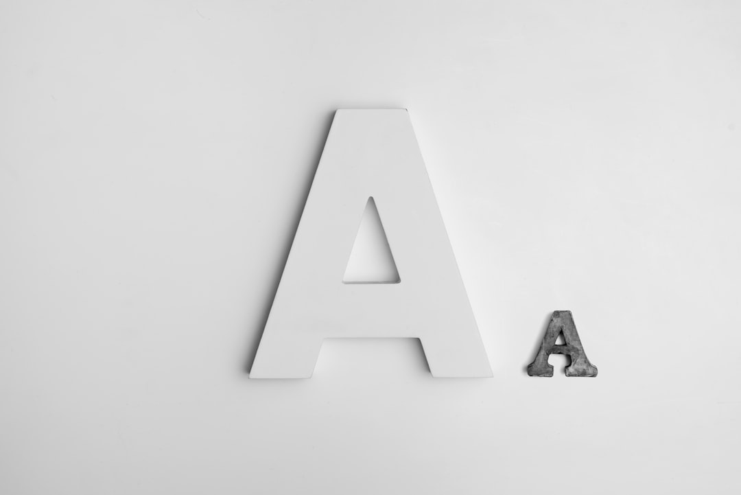
Step 4: Pick 1–2 Fonts Only
Fonts matter more than people think.
They communicate feelings.
- Serif fonts → classic, trustworthy, traditional
- Sans serif fonts → modern, clean, simple
- Script fonts → elegant, creative, personal
For most startups, a clean sans serif font is a safe bet.
Use two fonts max. One is even better.
Avoid overly decorative fonts. They age badly.
Step 5: Choose Your Colors Wisely
Colors trigger emotion.
- Blue → trust, security, tech
- Green → growth, health, nature
- Red → energy, passion, urgency
- Black → luxury, power, simplicity
- Orange → creativity, enthusiasm
Pick 1 main color.
Add 1 accent color if needed.
Test your logo in:
- Full color
- Black and white
- White on dark background
If it works in black and white, it’s strong.
Step 6: Use Free or Cheap Design Tools
You don’t need Adobe Illustrator (unless you want it).
Here are beginner-friendly tools:
- Canva – Easy drag and drop editor
- Looka – AI logo generator
- Hatchful by Shopify – Free logo builder
- Adobe Express – Simple but powerful
- Figma – Great if you want more control
Tool Comparison Chart
| Tool | Skill Level | Best For | Price |
|---|---|---|---|
| Canva | Beginner | Quick drag and drop logos | Free + Paid |
| Looka | Beginner | AI generated logo ideas | Paid |
| Hatchful | Beginner | Fast free logos | Free |
| Adobe Express | Beginner to Intermediate | More customization | Free + Paid |
| Figma | Intermediate | Full control and precision | Free + Paid |
If you want the easiest path? Start with Canva or Looka.
Step 7: Don’t Rely 100% on AI
AI tools are helpful. Very helpful.
But they generate designs based on patterns. Which means…
Other startups might get similar logos.
Use AI for inspiration.
Then tweak. Adjust. Personalize.
Change the font.
Adjust spacing.
Refine colors.
Make it yours.
Step 8: Test It Everywhere
Your logo will live in many places:
- Website header
- Social media profile picture
- Business cards
- Packaging
- T-shirts
- Pitch decks
So test it.
Shrink it to tiny size.
Does it still look good?
Make it very large.
Still sharp?
Put it on a dark background.
Still readable?
If it fails in one format, fix it before launch.
Step 9: Get Feedback (But Not From Everyone)
Feedback is important.
Random opinions? Not so much.
Don’t ask 25 people. You’ll get 25 different answers.
Instead:
- Ask 3–5 people
- Preferably your target audience
- Or other entrepreneurs
Ask specific questions:
- What feeling do you get from this logo?
- What type of company would you expect this to be?
- Is anything confusing?
Look for patterns in responses. Not one-off comments.
Step 10: Prepare the Right File Types
This part is boring. But critical.
You will need:
- PNG (transparent background)
- JPEG (for general use)
- SVG or EPS (vector format for scaling)
- Black version
- White version
Vector files are extremely important. They allow your logo to scale without losing quality.
If your tool doesn’t export SVG, consider switching tools.
Common Mistakes to Avoid
Let’s save you from regret.
- Following trends too closely
- Using generic stock icons
- Copying competitors
- Overcomplicating the design
- Using low resolution files
- Designing only for desktop (forgetting mobile)
Trends fade.
Strong branding lasts.
A Simple Logo Formula You Can Use Today
If you’re stuck, try this formula:
Clean sans serif font + subtle spacing adjustment + one strong color + optional simple geometric icon.
That’s it.
For example:
- Startup name in bold uppercase
- Slightly increased letter spacing
- Deep blue color
- Small circle or line element
Modern. Professional. Timeless.
When Should You Actually Hire a Designer?
Sometimes DIY is not enough.
Consider hiring a designer if:
- You’re raising serious funding
- You’re entering a highly competitive market
- Branding is central to your strategy
- You’ve rebranded multiple times and still feel unhappy
Think of your DIY logo as Version 1.
Many successful companies redesigned later. That’s normal.
Final Thoughts
Designing your own startup logo is not about being perfect.
It’s about being clear.
Keep it simple.
Make it readable.
Make it memorable.
You don’t need fancy tools.
You don’t need a design degree.
You need clarity.
And the courage to start.
Your startup will evolve.
Your logo can too.
But today?
You’re more than capable of creating something strong.
Open your laptop.
Pick a font.
Choose a color.
And build the face of your brand.


Leave a Reply