Banner ads were always important and useful for business promotion. Even though the internet is dynamic and the rules always change, banner ads still stand high. Banner ads are one of the most popular and used marketing methods nowadays.

Internet is the one thing in common for almost the entire world, so it is effective to use it for strong promotions. It is the cheapest way to get the attention of a large audience. Banner ads can improve the image of your business, improve the work and bring more customers.
However, not any banner can do the magic work. To make an effective and attractive banner, it takes a lot of time and effort for creative teams to come up with ideas and realization. If you are stuck and don’t know how to start, this article will help you.
Here is the list of 8 banner ad design tips for better banners to get you more clicks.
1. Banner Format and Size
Google allows you to edit and adjust the banner size and format with different options. Still, it is recommended to use three classical standard formats:
- The leaderboard is a horizontal banner always placed at the top
- The square is usually included in content or sidebar
- The skyscraper is a vertical banner that usually appears on a sidebar
Even though banner ads are responsive and can fit any display, it is recommended to design ads within the limits of common sizes. These standard formats can be in numerous sizes, but you should stick with standard banner sizes that take about 90% of all online banner ads. Depending on the content and place, select between:
- Leaderboard banner 728×90
- Medium banner 300×250
- Wide skyscraper 160×600
2. Simple Text and Fonts

The text should not be long and complicated. Instead, it should carry a simple yet strong message. Also, don’t use many different fonts since it might remove focus from the message.
3. Animation and Visualization
Add content-related animations and high-quality graphics and images. Still, be careful that it does not distract from the banner’s goal.
4. Framework
Include a framework around your content to drive more attention and focus on the inside. Usually, frameworks form boxes with 1-pixel thick borders.
5. Location (Banner Related to the Website’s Content)
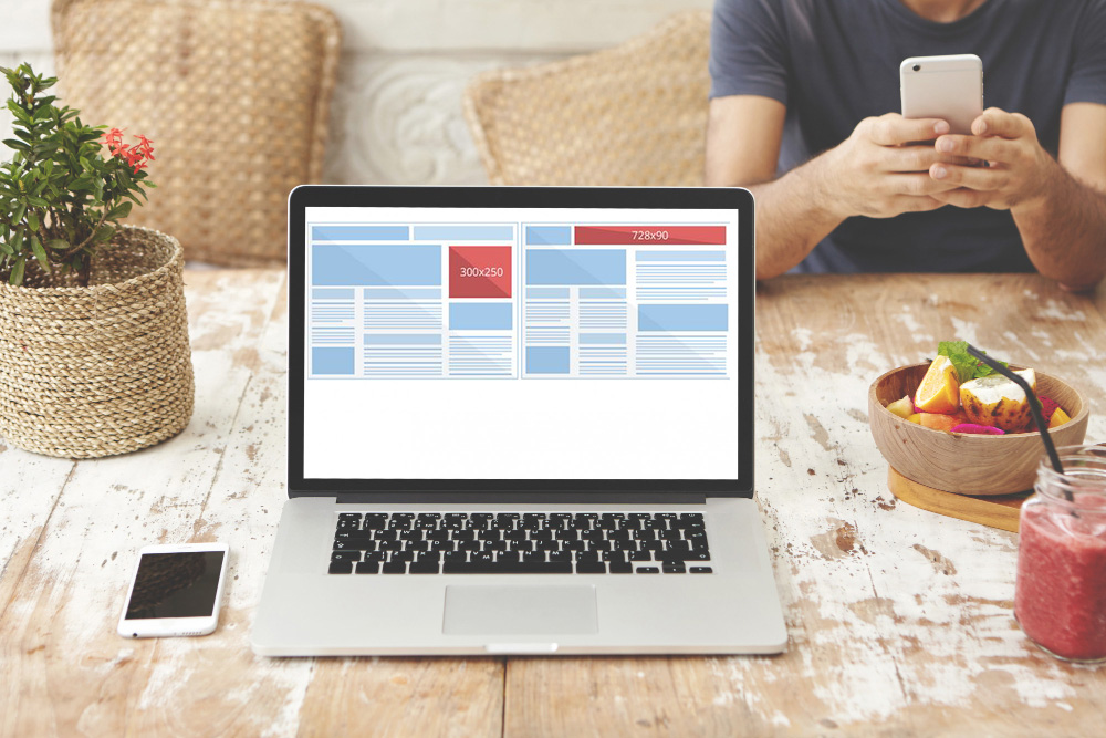
Select websites as your ad display related to your work and the content you are trying to present. If the banner does not respond to the content, visitors are not likely to click on it and visit you.
6. Simple Is Often Better
Simple text and effective graphics are enough. Large files can load slowly, often not displaying it at all.
7. Rules of Hierarchy
Every banner ad should firstly contain a company’s logo. Next, it sends a message about a service or a product and finally emphasizes time-limit or prices.
All these parts are important to attract visitors and assure them that you are different than others.
8. File Format
Loading time is important to display messages as fast as possible. On the other hand, flash ads require more resources.
Also, they are outdated since it is recommended to keep the banner as simple as possible. That is why classical JPG, GIF, and PNG formats should be your choices.
Conclusion
These tips are basic yet crucial to get more clicks on your banners. If you follow the simplicity and place your banner ads on contently related websites, it will help you increase your traffic and acquire several potential customers.
Stay focused on your brand and the message you are trying to send. If you do so, the banner ad will take you places!

